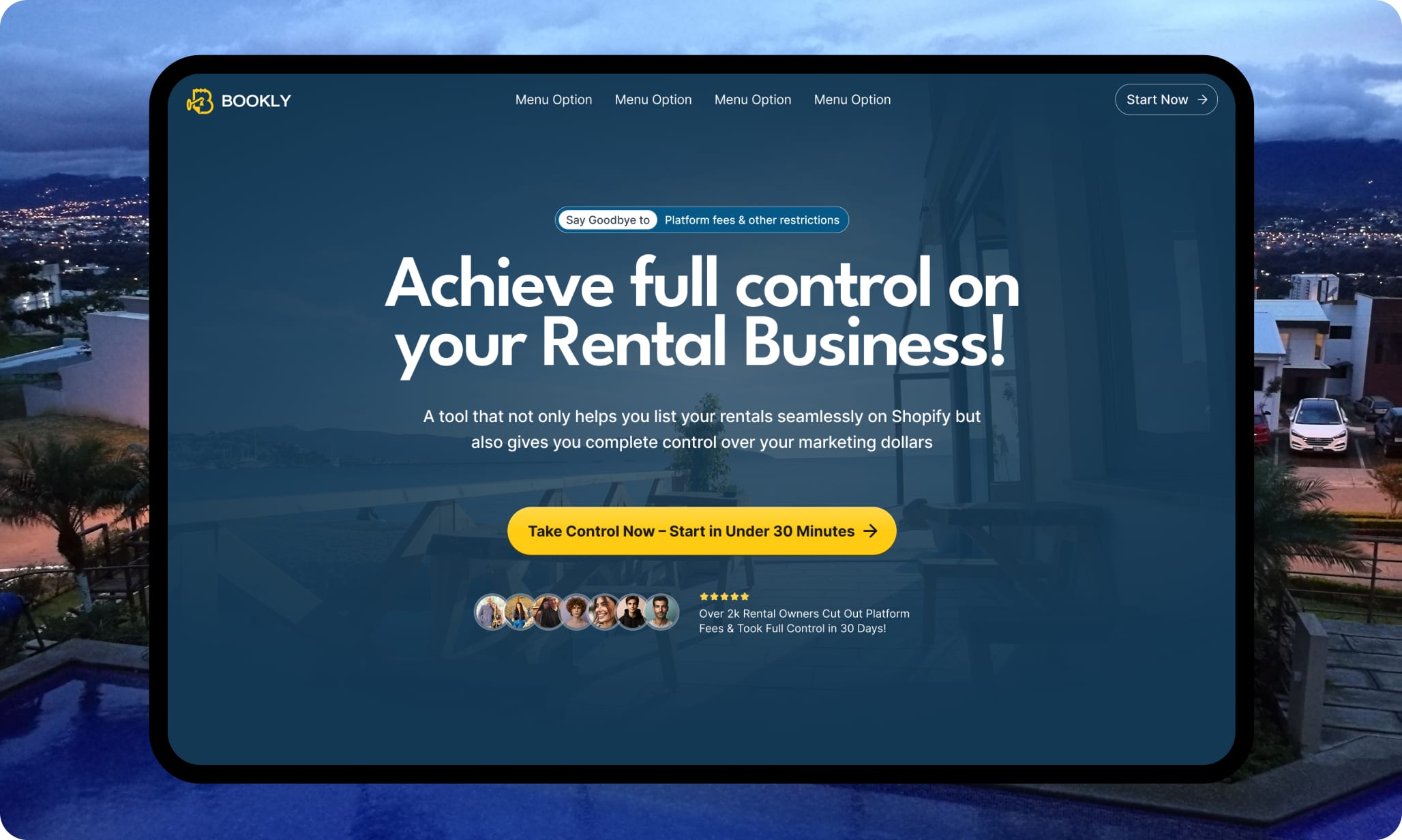

Nine days from brief to a booking funnel with teeth.
Bookly lets rental hosts take direct bookings on Shopify and keep what the platforms usually skim. They had the product; they needed the pitch. We delivered the brand, the landing page and the ads that feed it — researched, wireframed, designed and tested in a nine-day sprint.
A product built to end commissions needed a page that could close.
Bookly gives short-term rental hosts what the big platforms won't: direct bookings on their own Shopify site, a flat subscription instead of a commission, and their own pixel data. One problem — none of that sells itself. Hosts have been burned by “game-changing” tools before (their word; we've retired it). The brief: build the brand and the landing page that turn platform-fatigued hosts into confident switchers — and make it credible enough to hand over a card number.
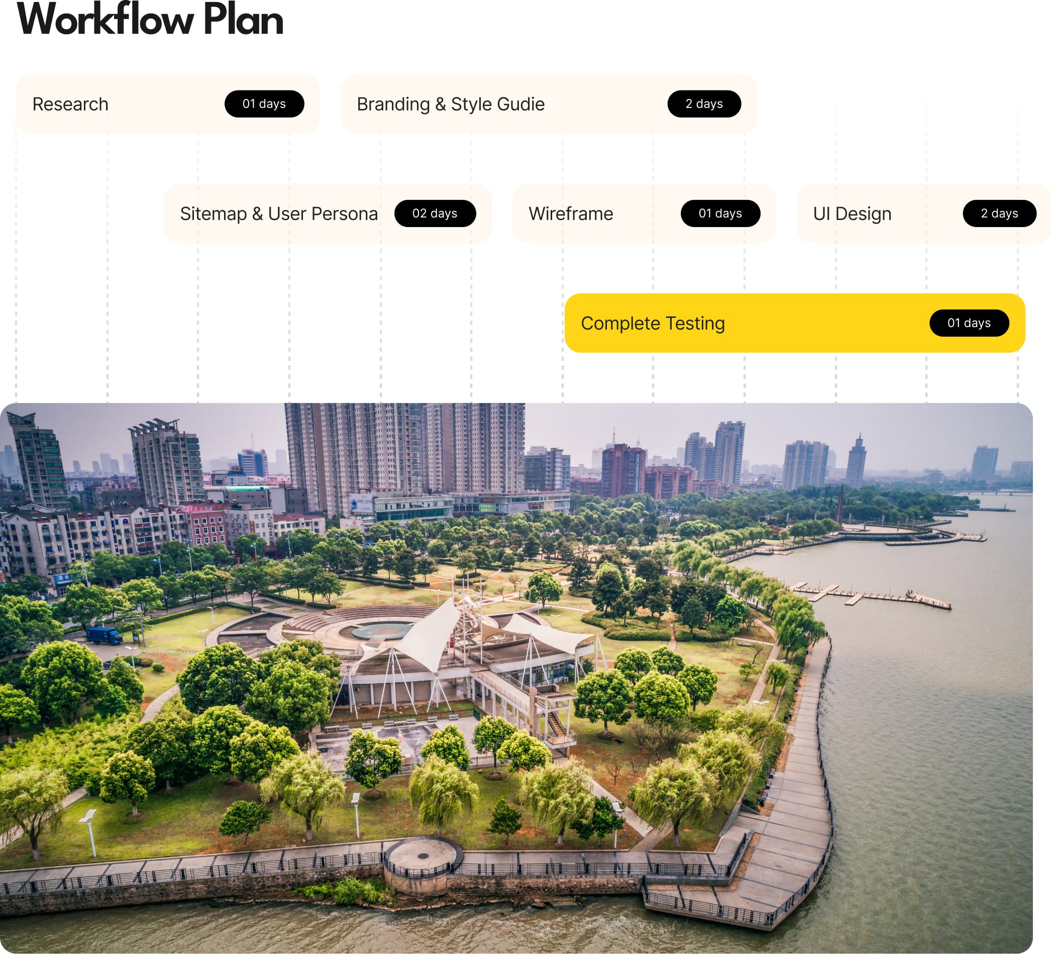
Six stages, nine days, zero filler.
- 01
Research — 1 day
One day in the rental-host trenches: competitor pages, platform gripes, and what actually makes a host click. Evidence first, opinions never.
- 02
Branding & style guide — 2 days
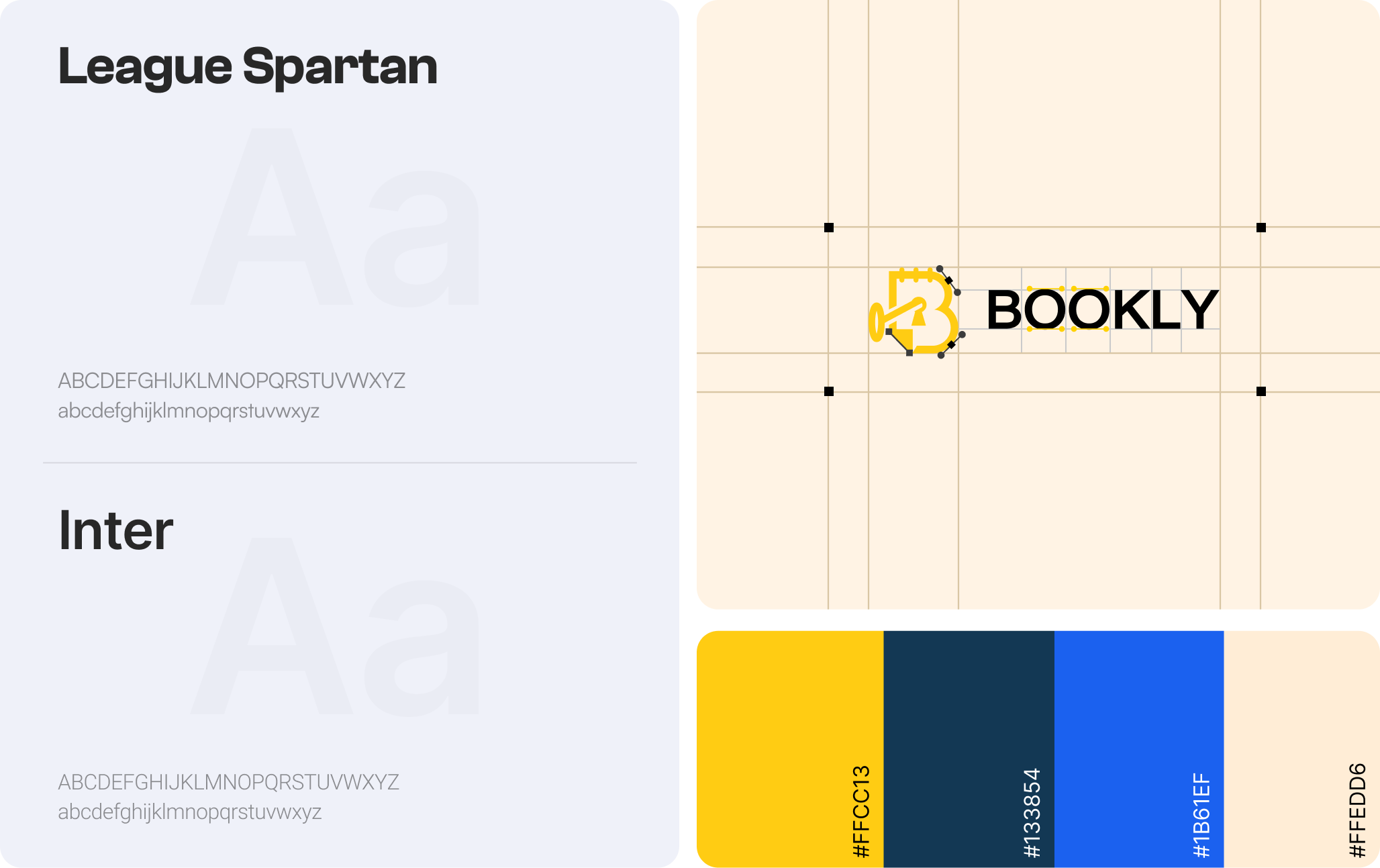
League Spartan for headlines that speak up, Inter for copy that stays out of the way, and a yellow-on-navy palette that makes the CTA glow like a porch light. Logo locked on a proper grid.
- 03
Sitemap & user personas — 2 days
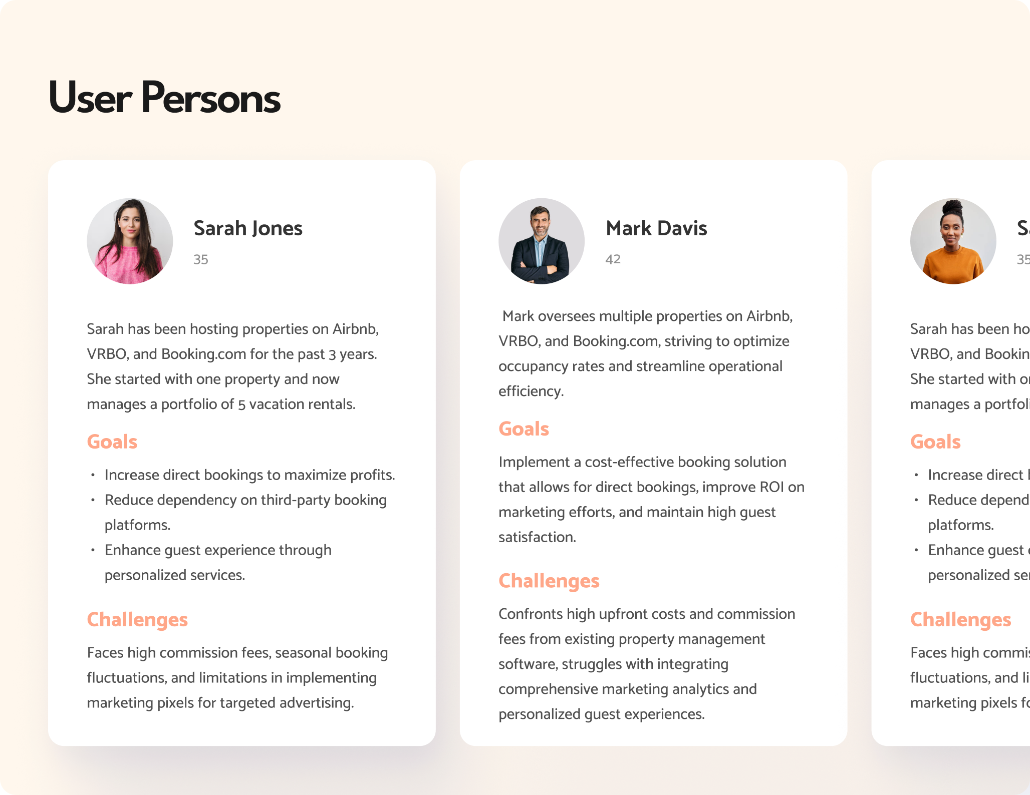
Three host personas — from the five-listing side hustler to the portfolio operator — and a page structure that walks each of them from skeptical to signed up.
- 04
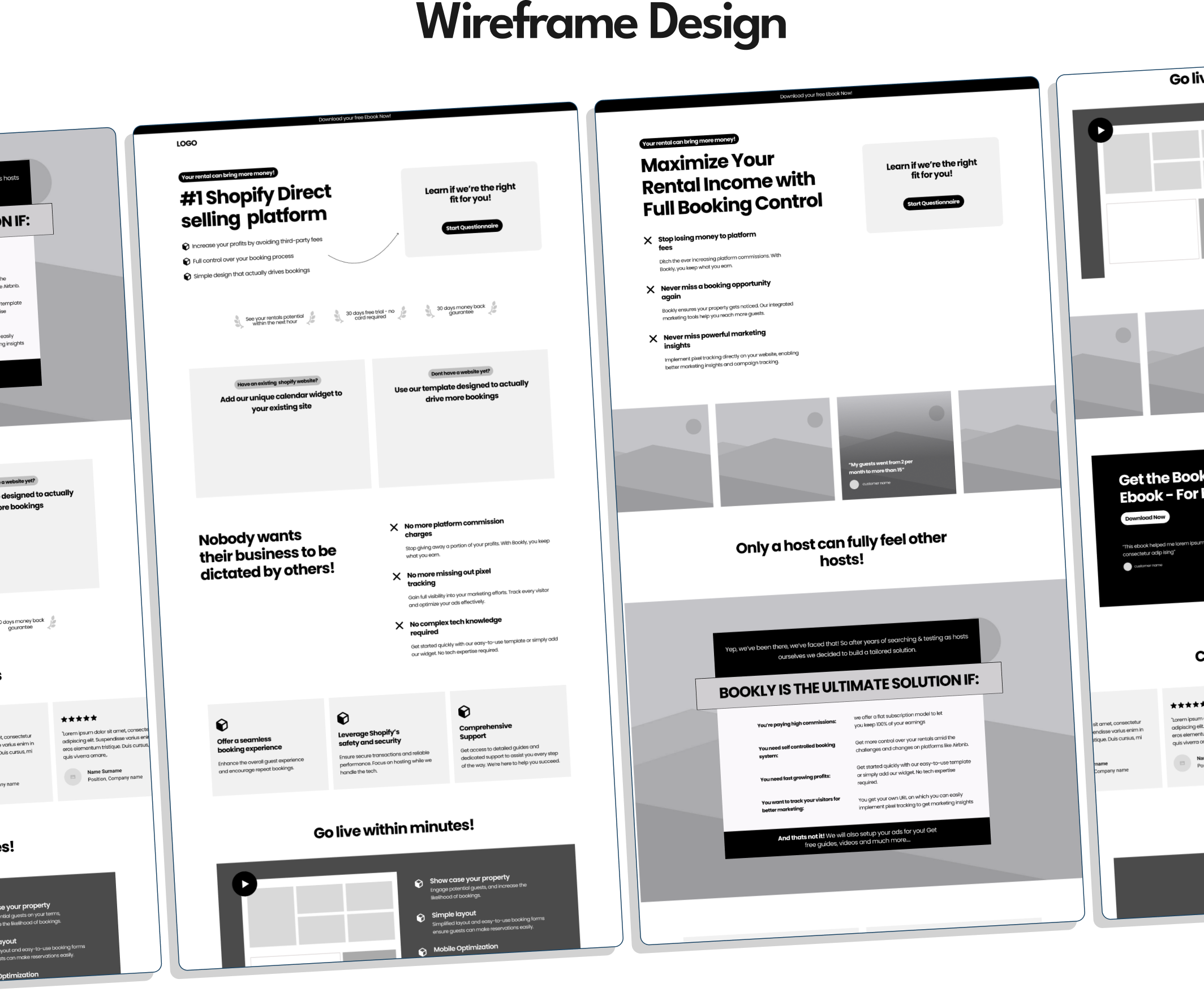
Wireframes — 1 day
Four full-page wireframes argued it out in grayscale. Structure wins before pixels get pretty — it’s cheaper to move boxes than to repaint them.
- 05
UI design — 2 days
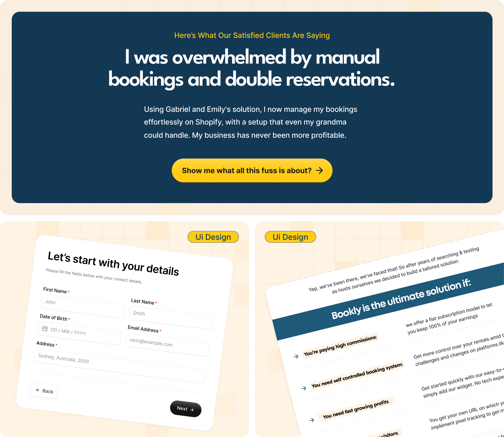
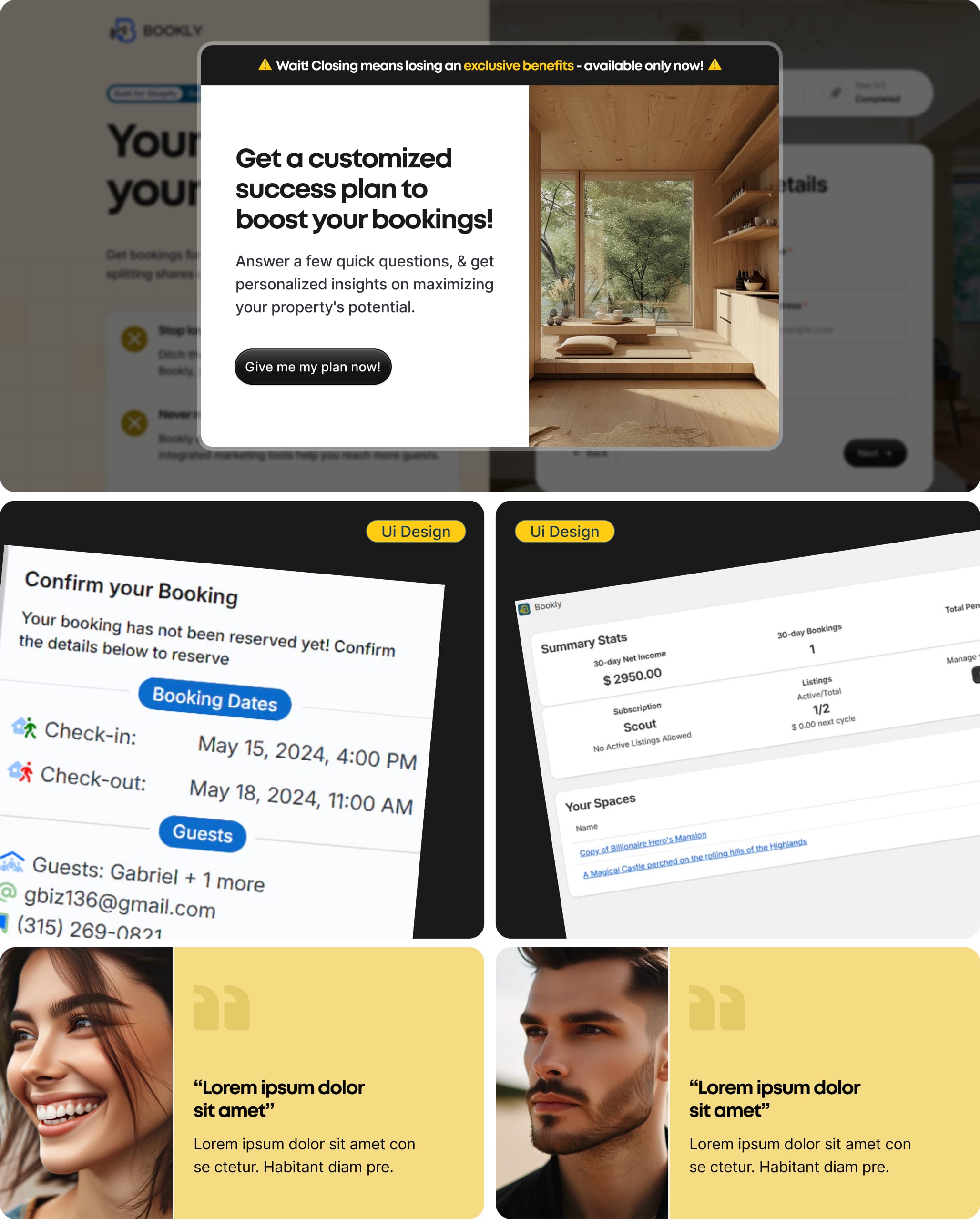
The winning wireframe got dressed: hero, comparison table, pricing bundle, three-step lead form, exit-intent popup. Every section earns its scroll.
- 06
Complete testing — 1 day
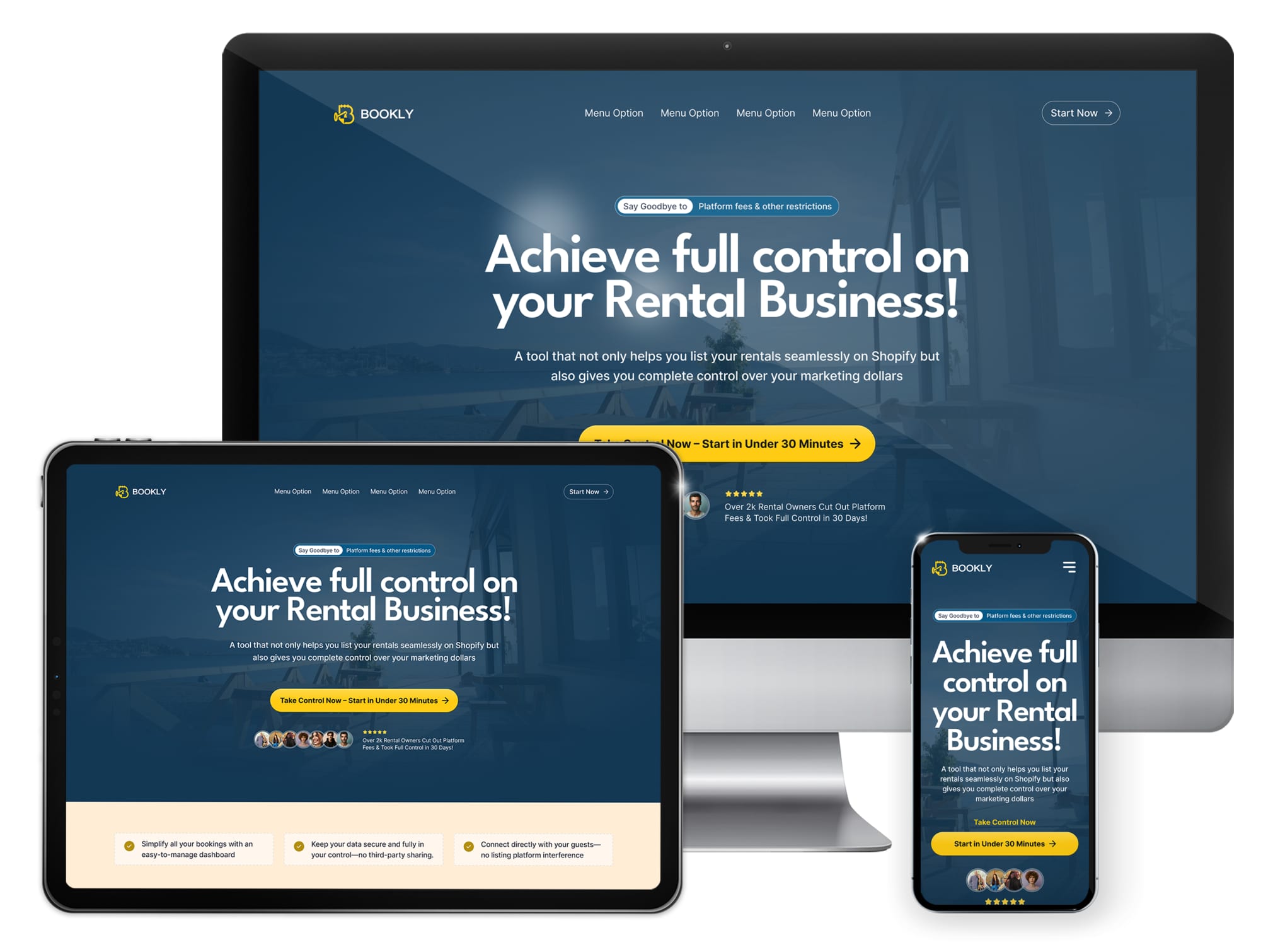
Desktop, tablet and mobile — clicked, prodded and proofread before handoff. “Ship it and see” is not a QA strategy.
A brand that glows like a porch light.
League Spartan and Inter, a confident #FFCC13 yellow on deep navy, and a logo built on a grid instead of vibes. Warm enough for hospitality, sharp enough for software — Bookly is both, and the brand has to promise each without mumbling.
A page that sells control, built with control.
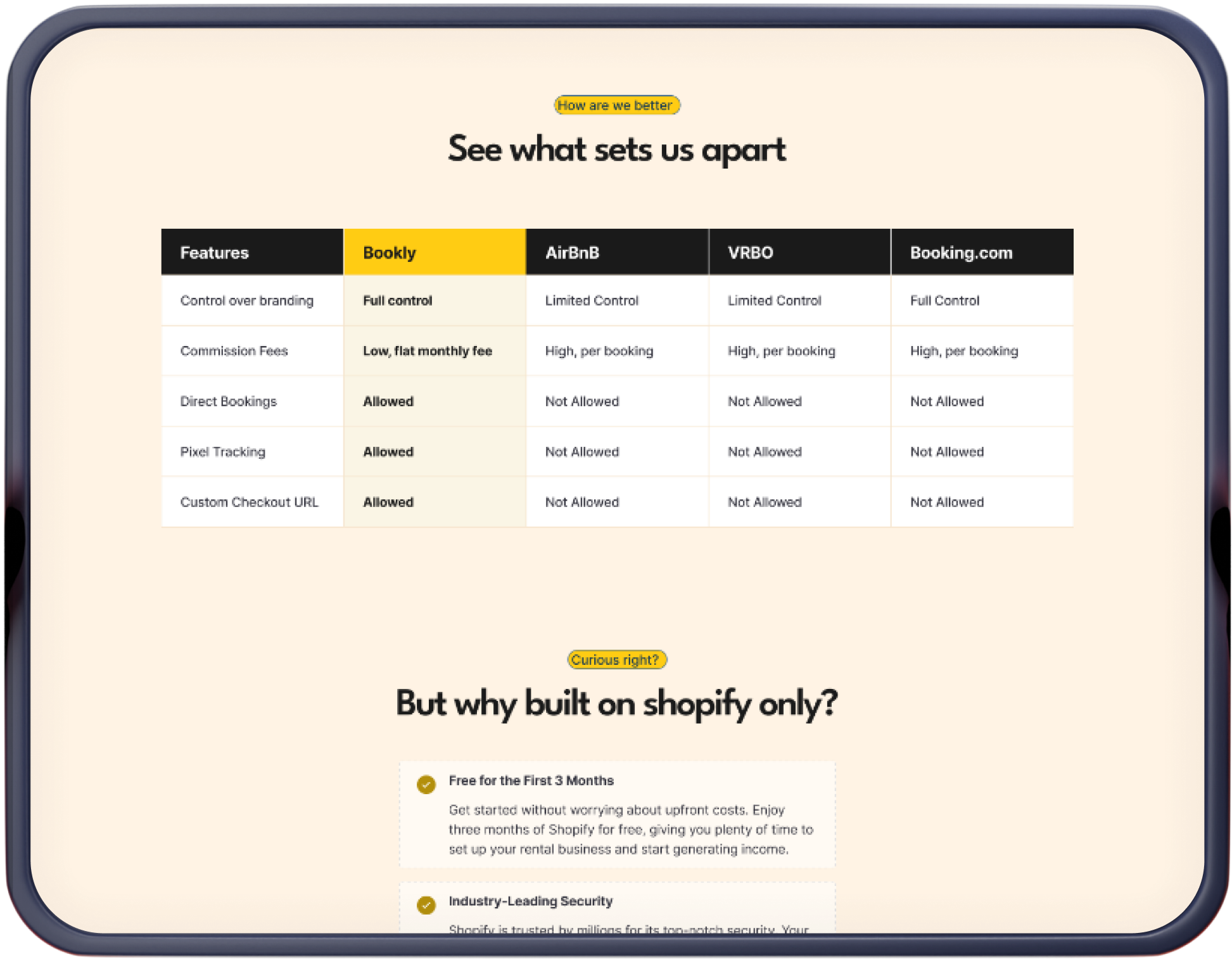
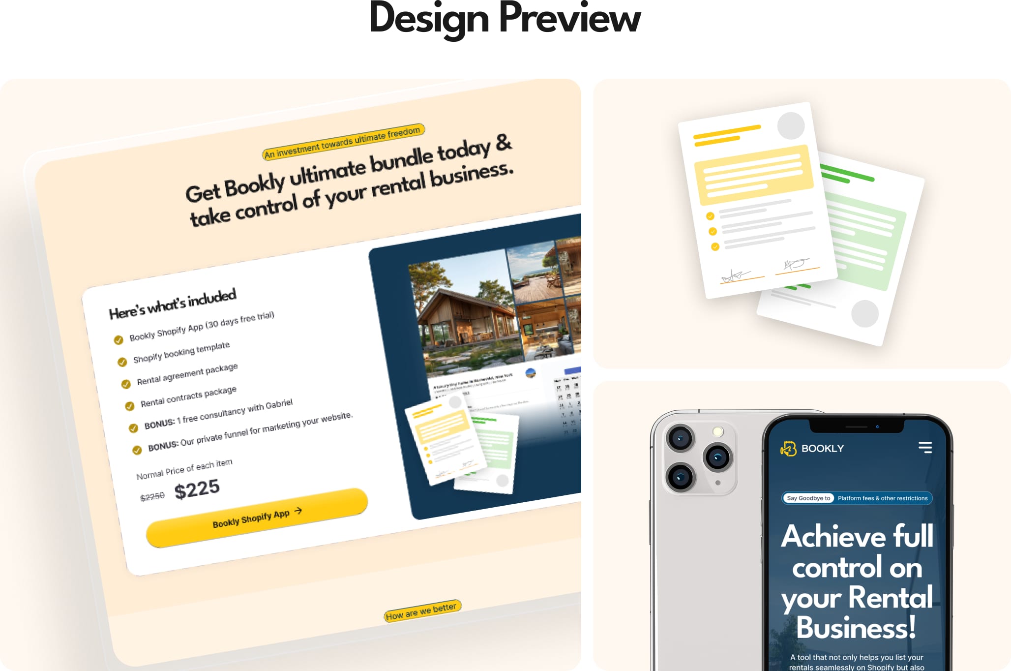
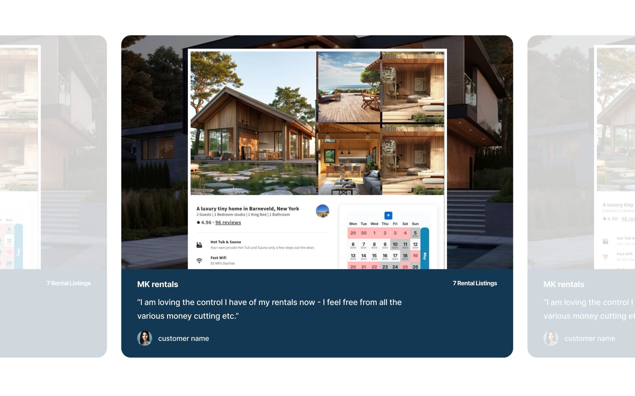
The final UI leads with the promise — “Achieve full control on your Rental Business!” — proves it with a feature-by-feature comparison against Airbnb, VRBO and Booking.com, then de-risks the yes: host testimonials, a $225 launch bundle, and a three-step form that asks for less than a hotel check-in. An exit-intent popup catches the almost-gone with a personalized success plan.
Inside the funnel.
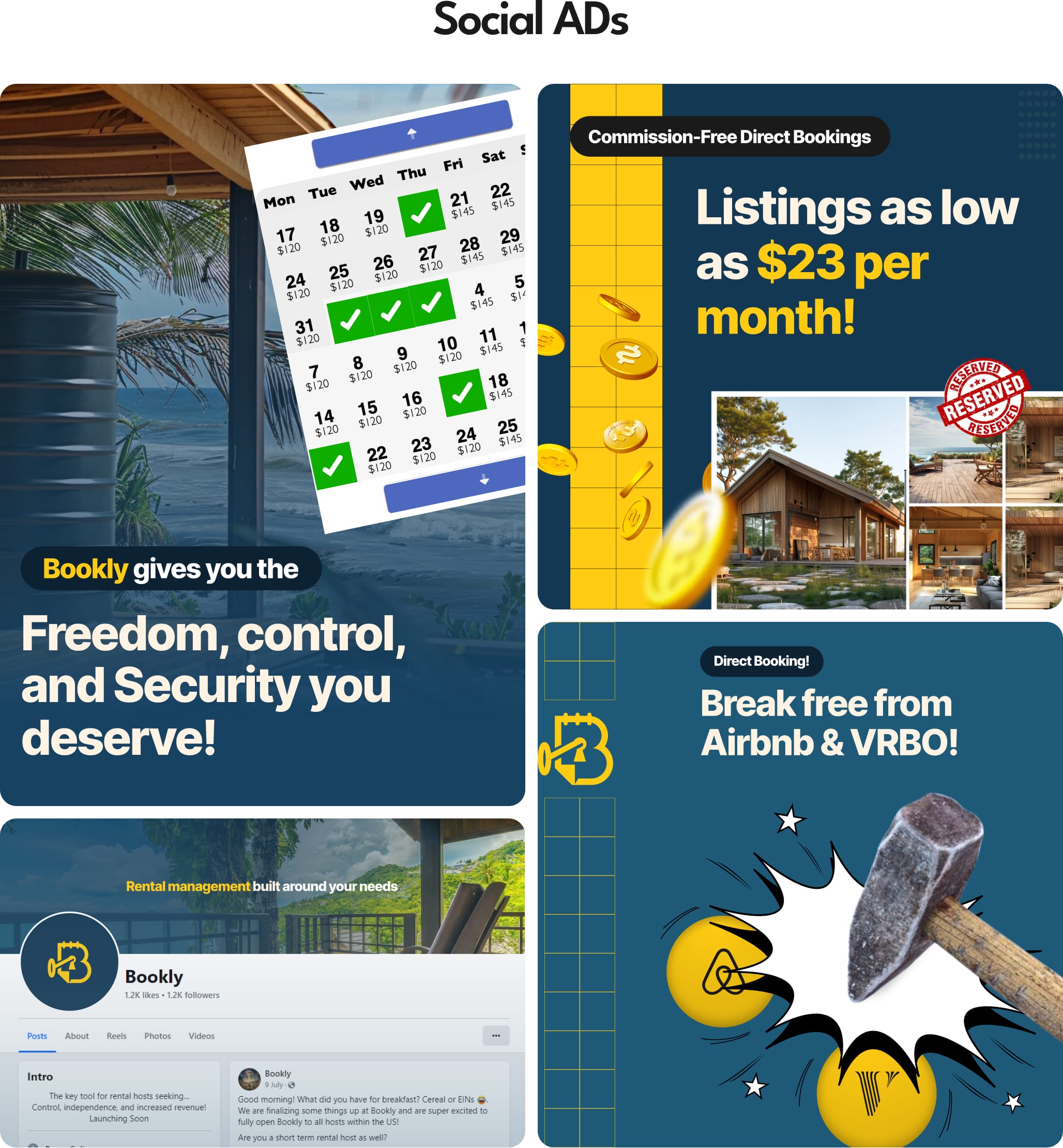
Ads that stop the scroll without begging for attention.
Four launch creatives to feed the funnel, including a hammer meeting the Airbnb logo at speed (“Break free from Airbnb & VRBO!”). Subtle? No. On-message? Completely — every frame repeats the promise the landing page keeps: freedom, control, and listings from $23 a month.